STRATEGIC MARKETING
At K Roberts & Co, our relevant marketing solutions, combined with timely and meticulous execution,
drive the incremental, profitable growth that organizations demand.
At KR&Co, we help build your brand — your Uniqueness Defined.
- Certifications
- SBE – Small Business Enterprise, License 214034905
- WBE – Woman–Owned Business Enterprise, License 214034905
- ESBE – Emerging Small Business Enterprise, License 214034905
- HUB – Texas Hub Certificate, License 1464257327400
K Roberts & Co
Focused . Attentive . Flexible
Kathy Roberts
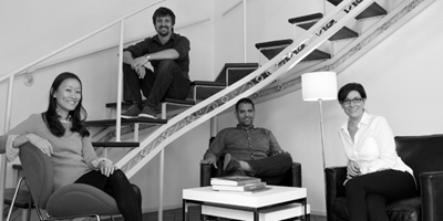
For over 30 years, our targeted strategies and flexible tactical implementation have benefited clients in the medical arena. From patient recruitment and the pre-hospital environment, to free-standing and acute care delivery, our knowledge in the medical device, biomedical, and general medical market provides a rich framework for the development of effective strategic initiatives. When you’re ready to work with a team that will quickly and intently focus on your unique marketing needs, call us. We’re ready to start the conversation.
Industry Professionals Commend Our Work
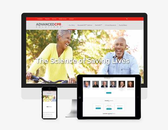
Phil Faris, Co-founder, Board Member, AdvancedCPR Solutions
Nate Surufka, Clinical Specialist, Organ Transplant at Paragonix Technologies
Kim Marie Macygin, MSN RN, Roadrunner Education
Jeanne Harman, BSN, Device Strategy Solutions
Mark Standeford, CEO, Renovo Concepts, Inc.
Monica Salmeron, MBA, Marketing Manager, Vidacare Corporation
Matt Jones, Sr. Product Manager, ENT Sinus Division, Arthrocare Corporation
Toni Cardiel, Global Marketing Manager, Teleflex, Inc. — Vidacare Business Unit
Daniel Shafer, ENT Business Manager, Spectrum Audiology
Strategic, Branded Marketing Solutions
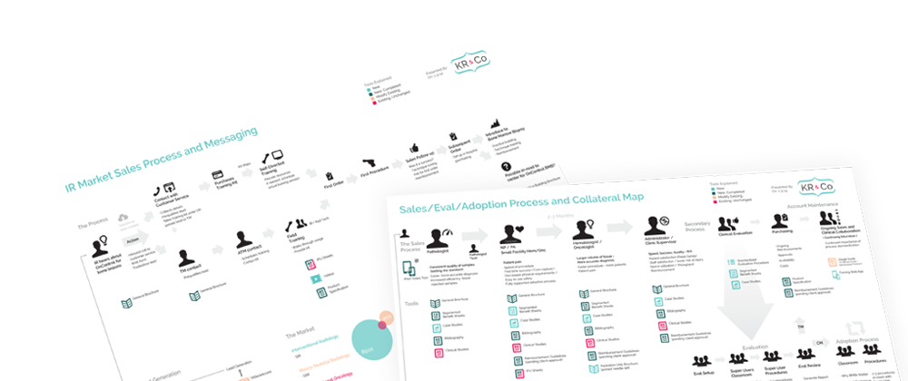
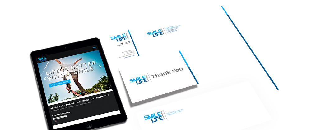
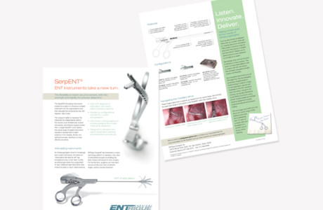
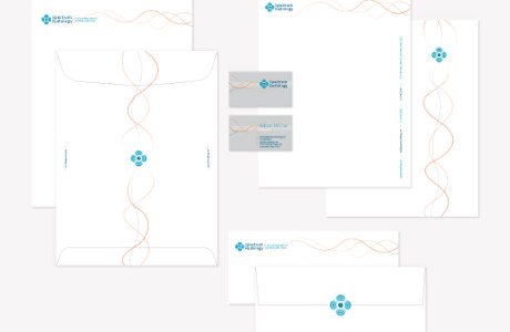
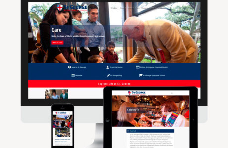
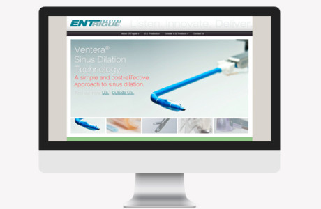
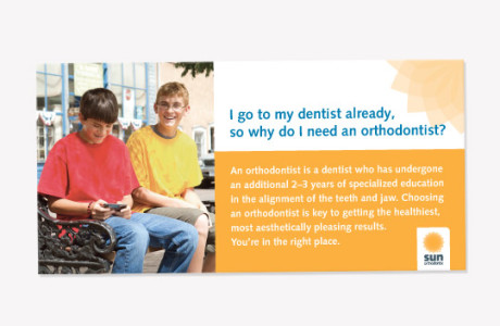
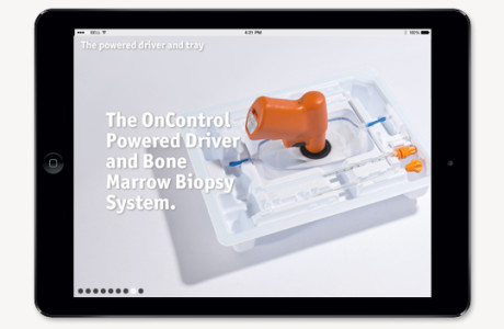
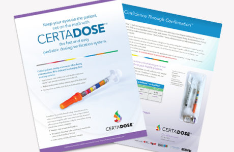
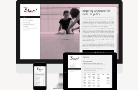
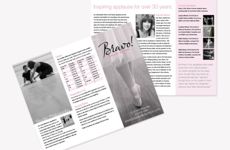
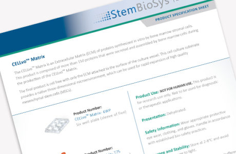
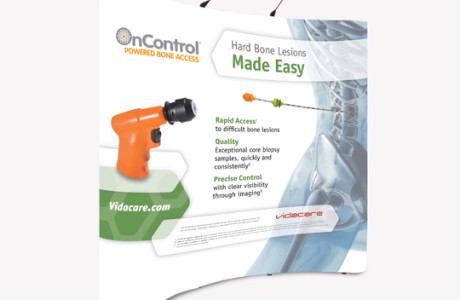
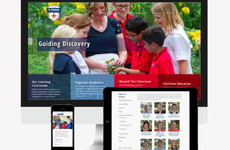
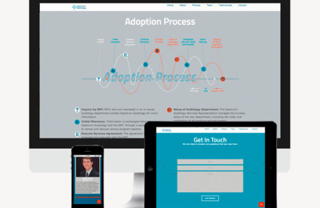
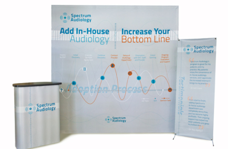
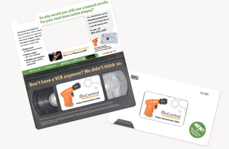
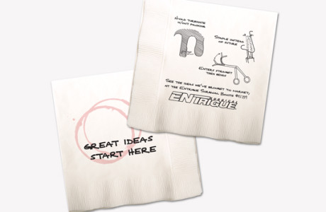
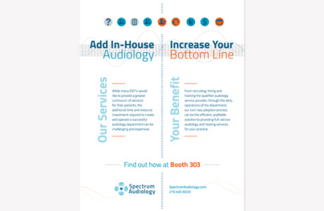
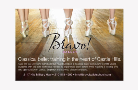
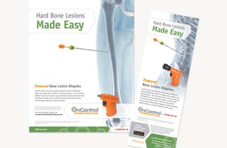
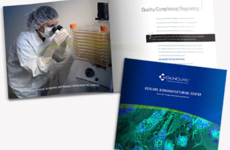
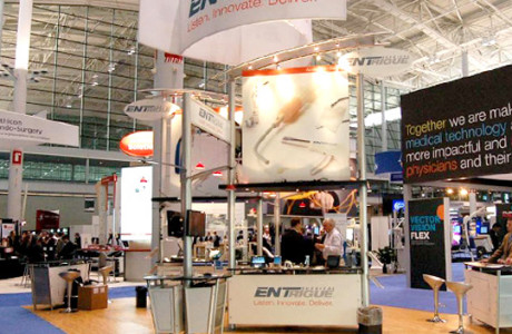
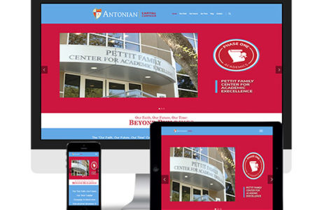
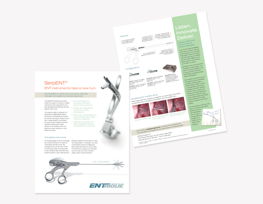
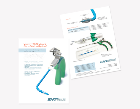
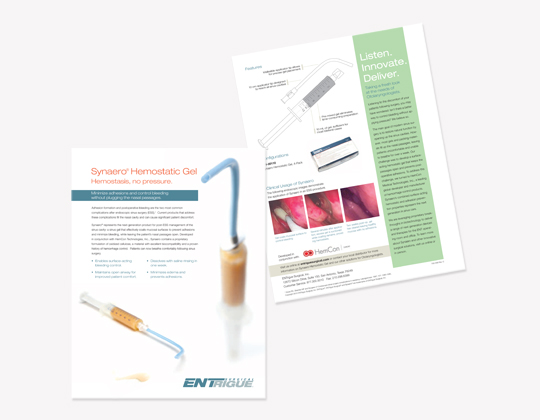
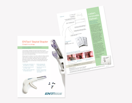
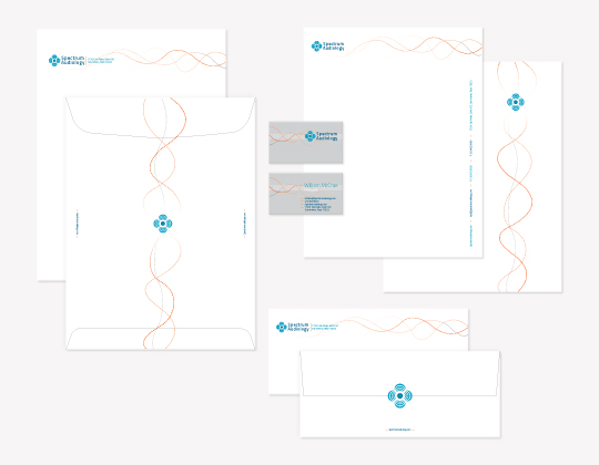
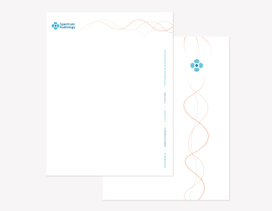
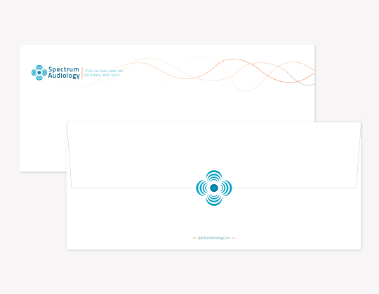
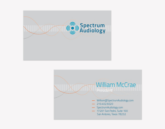
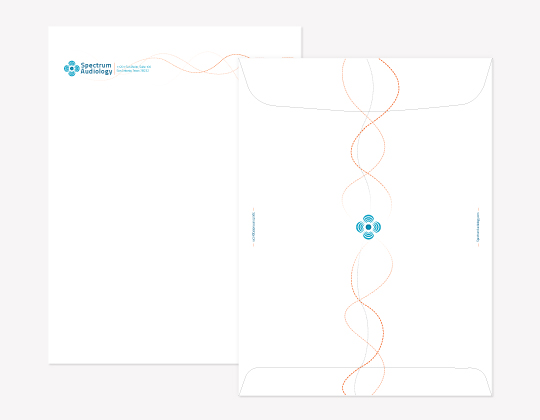
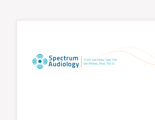
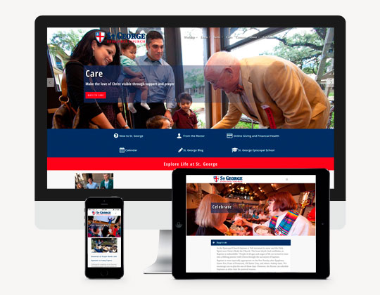
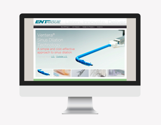
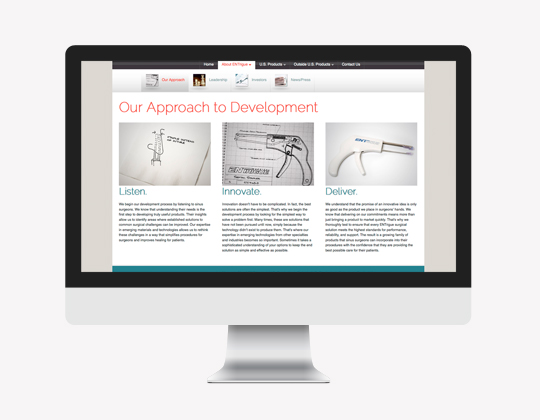
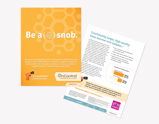
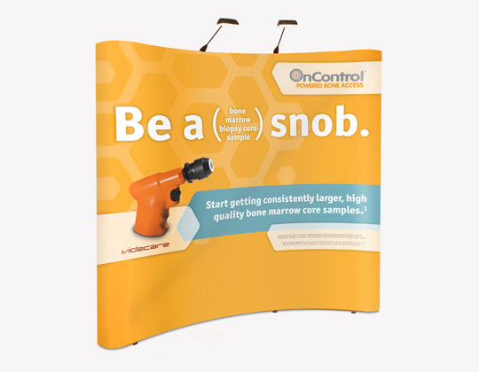
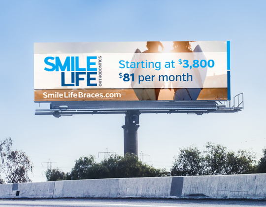
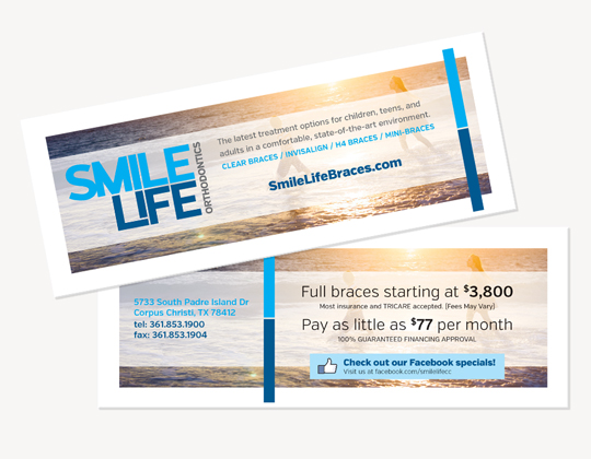
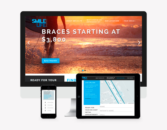
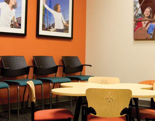
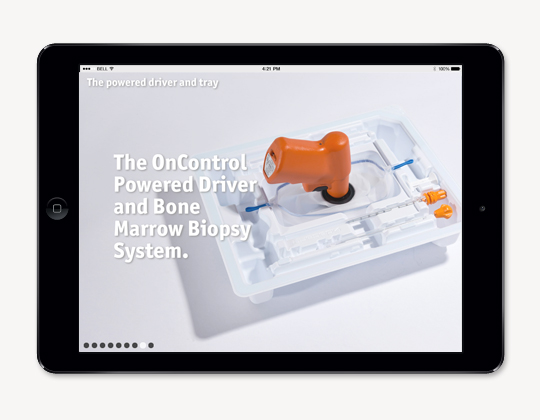
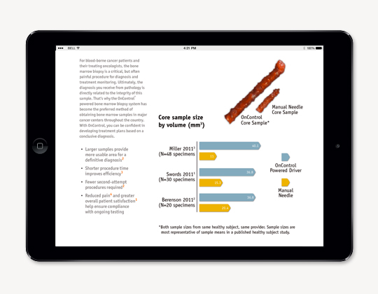
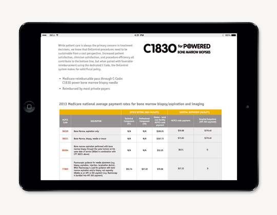
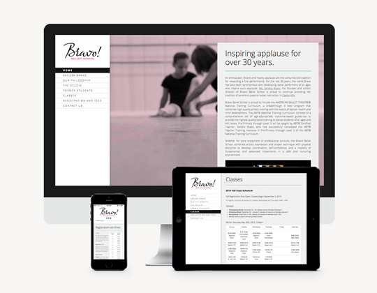
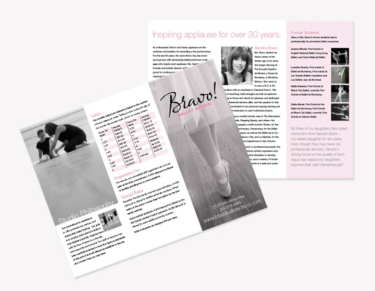
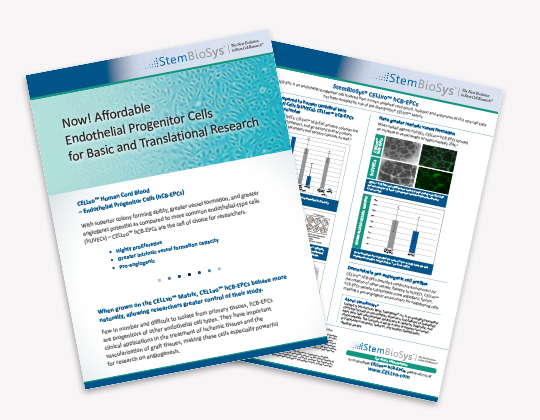
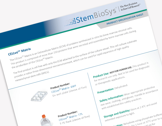
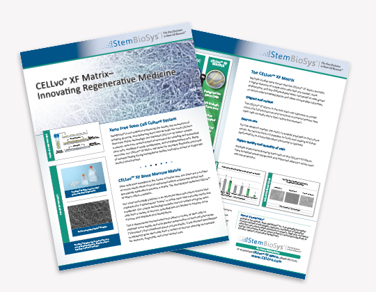
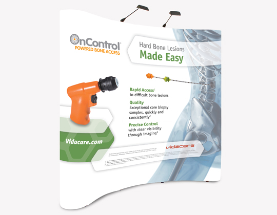
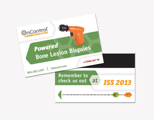
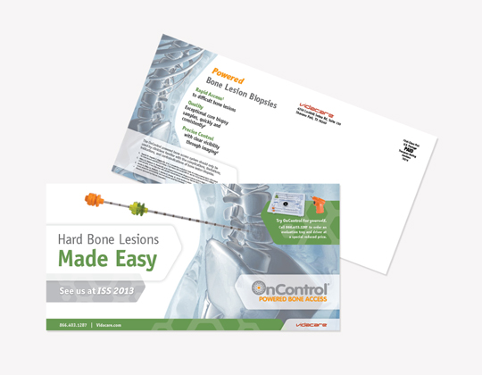
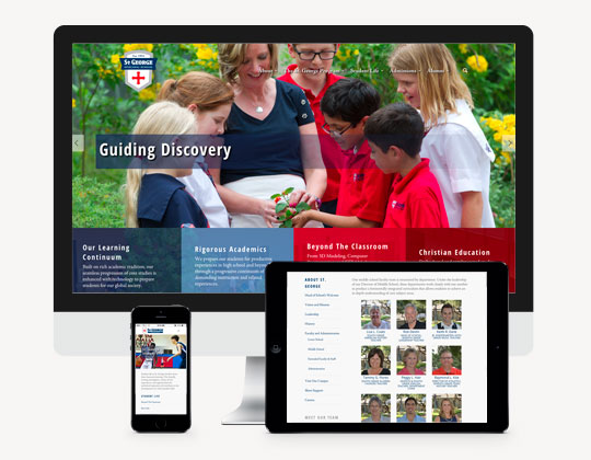
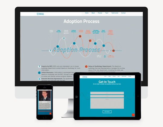
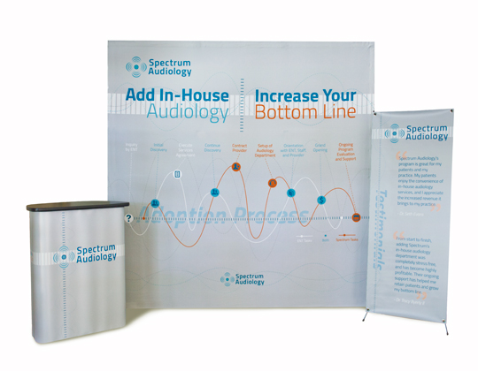
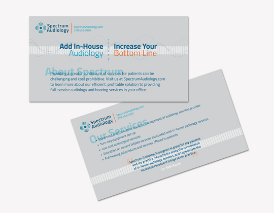
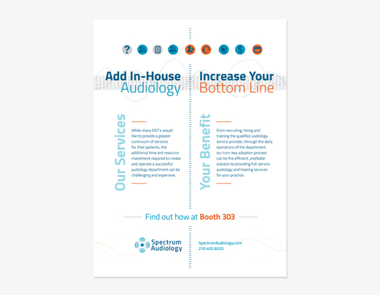
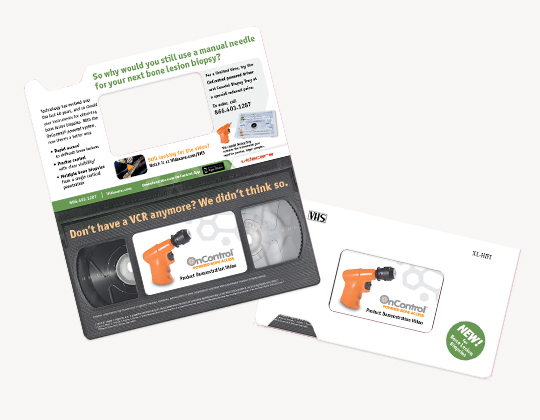
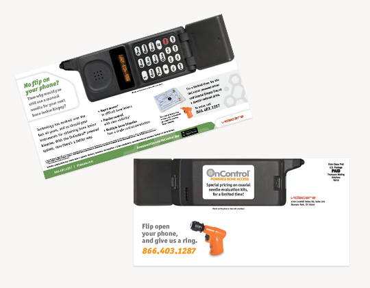
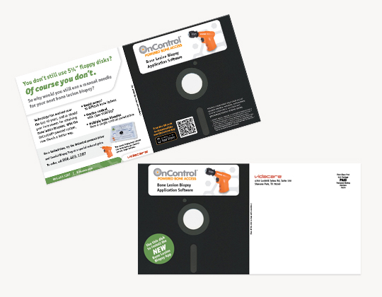
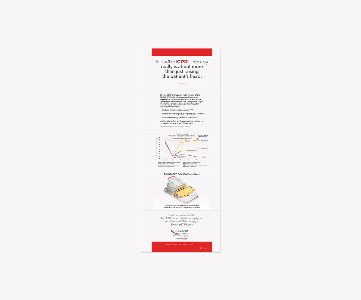
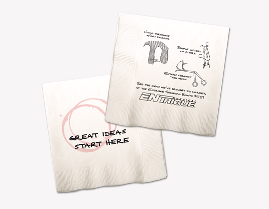
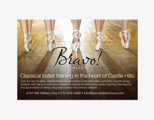
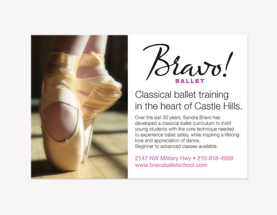
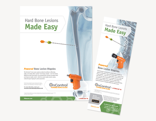
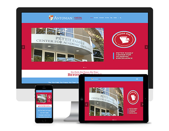
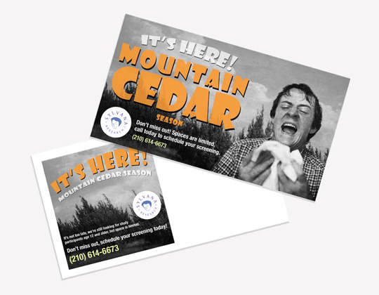
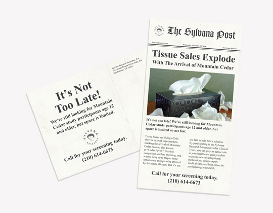
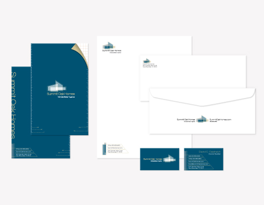
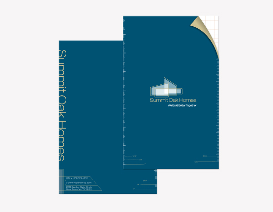
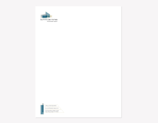
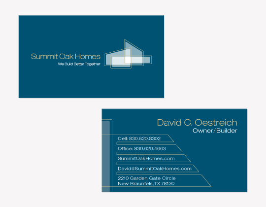
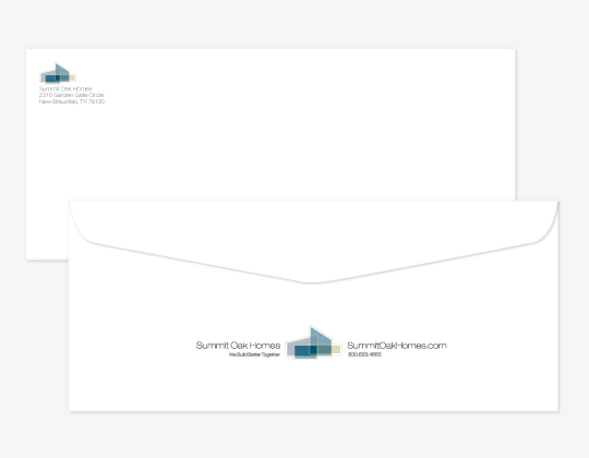
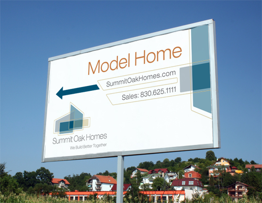
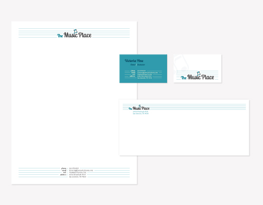
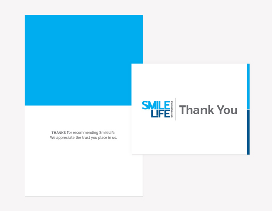
ENTrigue Surgical’s sales team needed a simple, efficient tool to educate customers about the products, and one that could be left behind as a reference point for customers. Sell sheets for each ENTrigue product were developed for the sales team to use during their sales calls. The sheets were one-page, front and back with close-up, macro images of the products, and a product description. Images from procedures were also featured to show the clinical use of the tool, along with product information for placing orders, and contact information. ENTrigue’s print collateral and advertising was designed to stand out in a crowd of established medical players and showcased them in a way that got instant attention. We embraced the roots and inherent benefit of their small company – innovation and approachability. Spectrum Audiology’s rebranding uses a heavy dose of clean, open space that is broken up by abstracted sound waves arranged in visually appealing asymmetrical format. Contemporary typography and a high contrast orange and blue color palette focus the attention where it’s needed amongst the liberal white space. Grey business cards call attention across the branding as the primary point of contact amongst the various stationary pieces. KR&Co created a site for St. George Episcopal Church that showcases the beauty and community spirit of the new Community Center and campus, and serves as the primary channel for communicating the church’s mission, and opportunities for worship and fellowship. The custom event calendar system allows the church to promote the many outreach classes and activities available to current and prospective church members, and the easy-to-use blog allows the church to stay in front of church members with informative, delightful, informal posts. From a strategic perspective, ENTrigue Surgical wanted to change their identity of an up-and-coming company, to an established player in the medical device industry. Their website is an entry touchpoint for potential providers, and needs to convey this message, as well as provide technical information about the instruments to engage prospective customers and encourage product trial. The website update was part of a larger brand refresh, for which we had already shot extensive custom photography. We decided to make the new site heavily photocentric, using the beautiful macro photographs of the ENTrigue Surgical product line. We built a rotating banner system and custom video player to display instrument photos and videos, as well as a custom, easy-to-use content management system. Medical tradeshows are typically filled with visually similar booth designs, close-up shots of new product, and exessive use of cliché doctor/patient stock photography. When Vidacare approached us to design the campaign materials for their upcoming pathology tradeshows, we knew we had to have some fun with it. With the obligatory product shot accounted for, we developed an edgy tagline as the main focus of the campaign. By encouraging viewers (pathologists) to be pickier about their biopsy samples and only settle for the best, we injected a little irony and suggested that, in this case, being a snob was a good thing. SmileLife’s promo campaign consisted of outdoor signage and buckslip flyers for local events. It was designed to be a visual extension of the SmileLife website that viewers would eventually be led to. Just like with the site, we used similarly bright and youthful photography paired with large bold typography and the brand’s monochromatic color palette. As part of an overall branding effort for this new multi-site Orthodontics practice , we created, designed and developed a new website. On the design side, the site needed to reflect the bright, modern feel we had established with their new logo. To achieve this we used bold typography and large, youthful imagery. As with all modern websites, the design needed to be responsive, meaning it must look just as good on a smartphone as it does on a large monitor. To execute our design, we built the site on the WordPress platform, giving the client an easy interface for making simple edits to content, while allowing KR&Co the flexibility to customize both functionality and design. ENTrigue’s print collateral and advertising was designed to stand out in a crowd of established medical players and showcased them in a way that got instant attention. We embraced the roots and inherent benefit of their small company – innovation and approachability. Whether that was by dropping a real cocktail napkin into a typically boring physician bag at a conference, or by making surgical products look beautiful, the ENTrigue story represents that moment of inspiration that every surgeon has: to make something better – for the surgeon and the patient. It also represents ENTrigue’s desire and willingness to listen to the ideas, to act on them and to improve them. To incorporate the brand experience in each of their six offices, we based color, texture and material choices on the branding elements we created for their practice. We then applied our location-specific custom photography to personalize each office and bring some life to ordinarily bare walls. Knowing that most new patients come from referrals, we integrated meaningful talking points on stretched canvases in all of the waiting rooms. These messages act as an important confirmation step for patients who have selected Sun Orthodontix for their braces, and help the new messaging take hold when those same patients tell their friends about the benefits of getting braces from Sun. Vidacare needed a sales aid for their OnControl product line that addressed the unique needs of multiple medical professionals who used or interacted with the device. In addition to addressing these different audiences, the tool needed to be easily updatable to accommodate ongoing clinical study data and published results. K Roberts & Co created a web-based, iPad-optimized microsite with multi-direction functionality that allows the sales rep to customize the presentation of information in a way that specifically addresses each viewer’s needs. Our singular, cost-efficient solution also provides an easy way to update the tool with corporate directed content via the web. And in the event that a face-to-face client meeting is not possible, our web-based solution, as opposed to an app or PowerPoint presentation, allows the sales rep to send a link so the client can view it at their leisure, on any device with an internet connection. When Sandra Bravo approached us about developing a brand for her ballet studio, the serendipity of combining her last name with a ballet school laid the groundwork for our creative. The celebratory script version of Bravo!, combined with a palette of soft pinks, blues, and rich black, provides the brand with the ideal measure of time-honored sophistication. With the opening of a new ballet studio, Bravo Ballet needed a simple website to showcase the staff, location and lesson schedules for parents and students to view. We photographed and incorporated large black-and-white images of students, the studio and the unique location of Villa Lorenz, to further showcase the sophistication of the Bravo Ballet logo. In addition to needing a website and logo, Bravo also needed a brochure to distribute to potential students and parents. A straightforward tri-fold brochure format includes bios, studio philosophy, and class schedule. The script version of “Bravo!” was used together with the palette of soft pinks, blues and rich black to further emphasize the sophisticated branding elements. StemBioSys is an emerging biomedical company that is innovating the field of regenerative medicine with their patented stem cell expansion technology and specialized adult stem cells. As part of an overarching branding effort, KR&Co developed Sales Aids and Product Specification Sheets for their new line of CELLvoTM adult stem cells and matrices. These marketing tools were designed to communicate the unique benefits of the CELLvoTM product line for researchers in need of cell expansion tools and high quality, rapid growth stem cells, and to help position StemBioSys as a market leader in cell expansion tools. OnControl participated in the International Skeletal Society tradeshow, and needed messaging to target the Interventional Radiologists who would be attending the show. To make the connection with the show attendees, we used a large skeletal image with the headline, “Hard Bone Lesions Made Easy” and applied the new OnControl rebrand elements to all touchpoints, which includes a booth graphic, the room key cards, and the premailer. It was important to relay this message of “ease” when using OnControl for hard bone lesions, since Interventional Radiologists are the key users of OnControl for hard bone lesions. St. George Episcopal School needed a new mobile-friendly website to showcase its new campus and revised brand identity. KR&Co’s solution was a modern, responsive, imagery-focused website. Large sliding banners feature headlines that convey the St. George experience, and imagery that captures the warmth of students and faculty, as well as the beautiful architectural elements of the newly built campus. The site’s streamlined functionality allows users to find specific information quickly and easily, including faculty and administration pictures and biographies. The site responds to the screen size on which it is viewed, and was built to be expandable and easily updatable. Incorporating the “adoption process” messaging and process map design that we created for Spectrum Audiology in the strategic development phase of our work, we created a website that clearly conveys their unique business model structure, bios, and contact information for physicians who are interested in their services. Spectrum Audiology needed a tradeshow booth with a compelling message about their “adoption process”, and a structural design that allowed for easy and approachable conversations between the Spectrum team and customers within the limits of a 10’x10′ space. We developed a process map that was featured on the booth graphic allowing for a concise message that easily grabbed the attention of the attendees, and succinctly explained Spectrum’s adoption process. A small counter and an X-Back banner with testimonials accompanied the large booth graphic, allowing for conversation and ease of traffic flow throughout the booth. We also developed a buckslip takeaway piece that drove customer traffic to the website where readers could contact the Spectrum Audiology team. Spectrum Audiology also featured this 4-color, full-page ad in the ENT Journal. This particular issue of the journal was distributed at the AAO-HNSF Orlando Expo Edition, an annual tradeshow organized by the American Academy of Otolaryngology – Head and Neck Surgery. The AAO-HNSF deems this tradeshow as “the world’s best gathering of otolaryngologists”, and as participants in the show, it was important for Spectrum Audiology to reiterate the message about their unique business model, what they offer, and the benefits for physicians attending the show. OnControl’s Powered Bone Access System represents one of the first major medical advances in the bone lesion acquisition procedure. Despite how obvious it would seem to stay current with medical technology, the majority of physicians in the industry still prefer the decades-old manual procedure. The concept of the direct mailers, featuring outdated technology such as the VHS tape, 5.25″ floppy disk, and the 90’s era cell phone, makes the comparison more relatable by playfully encouraging the recipient to “use” their outdated technology, when it’s obvious that such technology would not be used today, ultimately questioning the use of the manual biopsy needle. KR&Co recommended the creation of a corporate tagline to help prospective customers quickly identify the company’s focus and the overarching benefit of their products. The result was the tagline: The Next Evolution in Stem Cell Research that positions the company as an innovator in stem cell research and regenerative medicine. We were tasked by this young medical device company to help them stand out from the crowd at the nation’s largest annual tradeshow for sinus surgeons. Small but growing, Entrigue Surgical had an impressive, unique product to introduce to sinus surgeons, but couldn’t compete in size and scope with the big, established medical device companies. Since the tradeshow was held at a large, prominent hotel (complete with a downstairs lounge) we used a medium that demonstrated how many medical professionals sketch-out out their new product ideas: the cocktail napkin. However, in this case, the napkin was printed with the marketing message and call-to-action, and was delivered to surgeons in the tradeshow information bag. The concept garnered a 116% increase in qualified booth traffic from the previous year. Spectrum Audiology featured this 4-color, full-page ad in the ENT Journal. This particular issue of the journal was distributed at the AAO-HNSF Orlando Expo Edition, an annual tradeshow organized by the American Academy of Otolaryngology – Head and Neck Surgery. The AAO-HNSF deems this tradeshow as “the world’s best gathering of otolaryngologists”, and as participants in the show, it was important for Spectrum Audiology to reiterate the message about their unique business model, what they offer, and the benefits for physicians attending the show. The StemBioSys patented cell expansion microenvironment, originally launched by its scientific name of BM-HPME, did not convey its primary benefit to scientists and researchers. KR&Co recommended the creation of a corporate tagline and the re-brand of the product line to help prospective customers quickly identify the company’s focus and the overarching benefit of their products. The result was the tagline: The Next Evolution in Stem Cell Research that positions the company as an innovator in stem cell research and regenerative medicine, and the new product line name: CELLvo, that creatively plays on the tagline by tying the words “cell” and “evolution” into a name that is catchy, descriptive and trademarkable. To promote her new ballet studio, we created print ads for Bravo Ballet, which were featured throughout local San Antonio publications. Using the photography of her dancers we captured, we created ads that captured the essence of ballet, and the “romantic” feel of the ballet world. The OnControl team participated in Interventional Radiology tradeshows in both America and Europe. In addition to designing the booths and collateral materials for both tradeshows, we ran several print ads both domestically and abroad in preparation for the shows. These samples of a full page Euro and half page American ad showcase the implementation of the OnControl modular branding strategy, while satisfying text and imagery requirements set forth by the unique markets. ENTrigue’s print collateral and advertising was designed to stand out in a crowd of established medical players and showcased them in a way that got instant attention. We embraced the roots and inherent benefit of their small company – innovation and approachability. Whether that was by dropping a real cocktail napkin into a typically boring physician bag at a conference, or by making typically bland products look beautiful, the cocktail napkin has a special place in the ENTrigue story. It represents that moment of inspiration that every surgeon has, to make something better – for the surgeon and the patient. It also represents ENTrigue’s desire and willingness to listen to the ideas, to act on them and to improve them. ENTrigue Surgical needed a booth for their largest annual tradeshow to stimulate customer interest and encourage show attendees to stop and learn more about ENTrigue’s new technologies. We designed a booth with graphics featuring macro shots of ENTrigue Surgical’s instruments, and booth components that created a space for interacting with potential customers. Television screens featured macro images of all the new instruments, accompanied by provider and patient benefit statements. Different angles of each product, and a fly-in of the product title was applied to each instrument. We also created an iPad demo system featuring instrument in-service videos and photos that were used to engage and further educate Ear, Nose and Throat surgeons who visited the ENTrigue booth. Antonian College Preparatory High School asked KR&Co to develop a new website for their “Our Faith, Our Future, Our Time” Capital Campaign. Their goal was to raise $7.5 million dollars from alumni, school families, and community members to enhance the school with new buildings and expanded opportunities for present and future Antonian students to prepare academically, socially, physically, and spiritually for college and beyond. This website highlighted Antonian’s history and legacy of preparing young men and women for lives of learning and service. By clearly stating the campaign’s goals and crafting a compelling message for visitors to contribute, this website gives alumni and community members multiple reasons and opportunities to donate to the campaign and give back to their alma mater. Sylvana Research approached us to design their mountain cedar allergy patient recruitment mailers. Each year, one mailer is sent out before mountain cedar season begins to create awareness and drive candidates to contact Sylvana to see if they qualify for the study. A second mailer is sent once the season begins to generate a greater sense of urgency to qualify for participation. The mailers personify the entire mountain cedar season as some sort of terrorizing monster but in a very tongue-in-cheek sort of way. The Year One mailers took visual cues from 1950’s horror film posters with their grainy black and white photography and typographic treatment. The Year Two mailers evoke a similar feeling but take a little inspiration from the famous satire tabloid, Weekly World News. These themes help create the excitement needed to recruit patients during the limited timeframe for testing, without seeming like an actual emergency. Following the completion of a capital campaign to update and rebuild the campus, St. George Episcopal School wanted to refresh the school’s brand to reflect the newly built modern, streamlined architecture of the campus. Using the main graphic elements from the original brand as the base {namely the shield and the blue bar} KR&Co created a clean contemporary look with a reflective nod to the school’s 60 year history. The new brand was employed throughout the school, marketing touchpoints, and uniforms. Summit Oak Homes is a highly respected, quality home builder in the Texas Hill Country area. Their rebrand came from a desire to expand their portfolio of sophisticated custom homes. To help them accomplish their goal, we designed a modern, abstract logo complemented by an understated color palette, and refined typography that targets their very specific audience. The Music Place approached K Roberts & Co wanting to expand their piano lesson business to include a variety of other instruments, and to be presented as a polished and well-rounded musical institution. Their new logo is whimsical but strong, employing a stylized music note and typography that reflects the soothing feeling that music often delivers. SmileLife was launched as the fresh, cool new company in an industry with customers that are usually less than enthusiastic about their services. To appeal to the teens that they typically serve, we differentiated them with a simple, modernist sans serif font, with a monochromatic color palette.Entrigue Surgical: Sell Sheets
Spectrum Audiology: Branding
St. George Episcopal Church: Website
ENTrigue Surgical: Website
Innervēn Logo
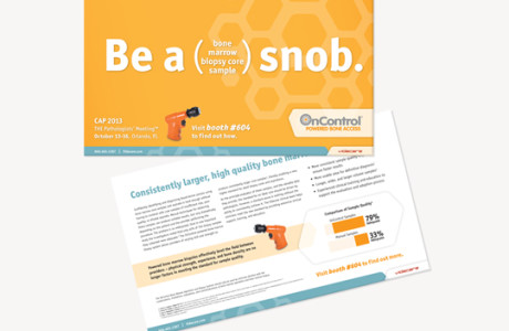
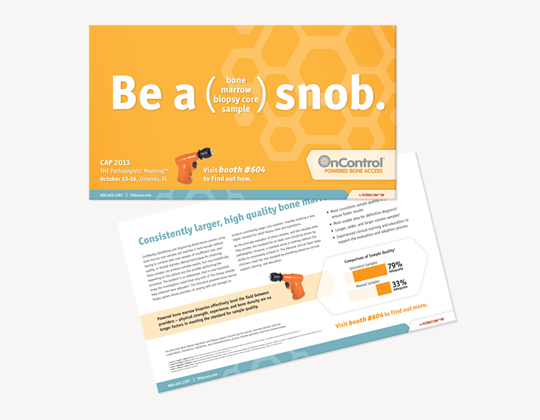
Bone Marrow Biopsy: OnControl Pathology Tradeshow Campaign
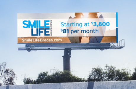
SmileLife: Promotional Campaign
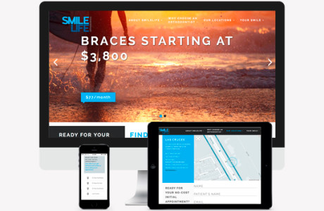
SmileLife: Website
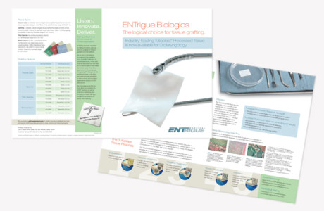
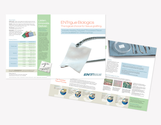
Entrigue Surgical: Biologics Brochure
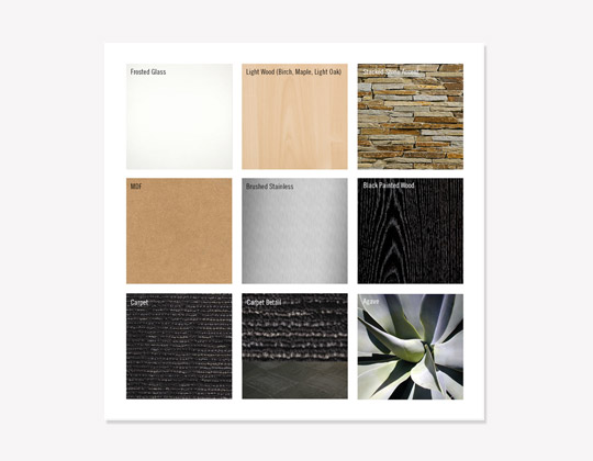
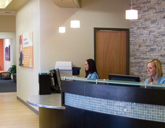
Sun Orthodontix: Environmental
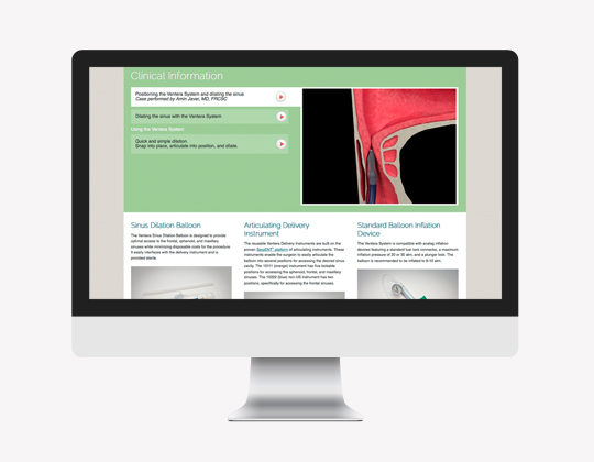
Bone Marrow Biopsy: OnControl iPad Sales Tool
Bravo Ballet: Branding
Bravo Ballet: Website
Bravo Ballet: Brochure
StemBioSys: Print Collateral
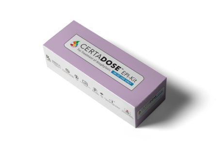
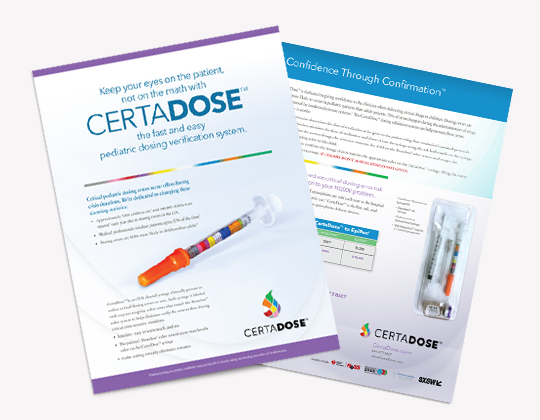
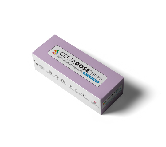
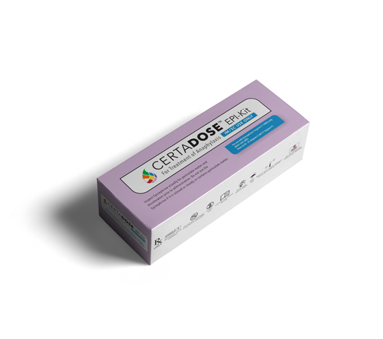
Certadose: Epi-Kit Box Design
Bone Marrow Biopsy: OnControl Interventional Radiology Tradeshow Campaign
St. George Episcopal School: Website
Spectrum Audiology: Website
Spectrum Audiology: Tradeshow Booth
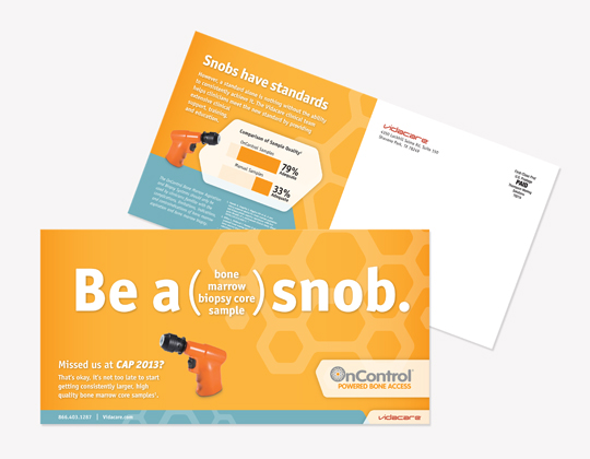
Bone Marrow Biopsy: OnControl Direct Mail Campaign
StemBioSys Tagline Development
ENTrigue Surgical: Tradeshow Bag Insert
Spectrum Audiology: Print Ad
StemBioSys: CELLvo Logo
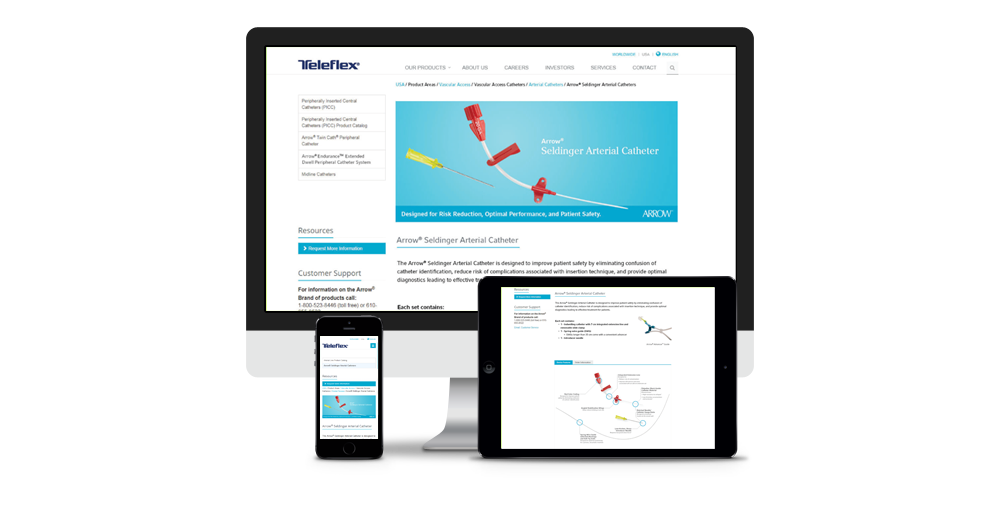
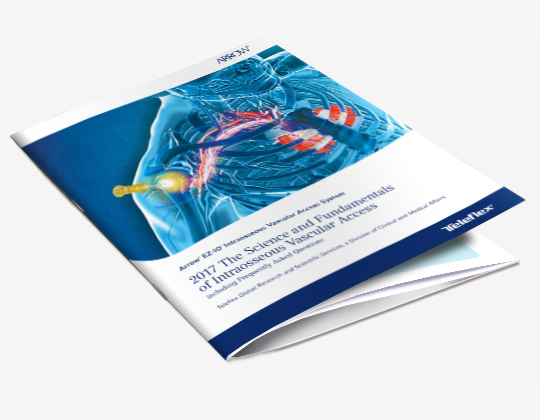
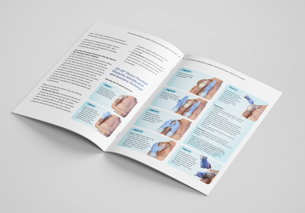
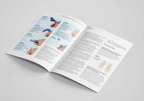
Teleflex Science & Fundamentals Book
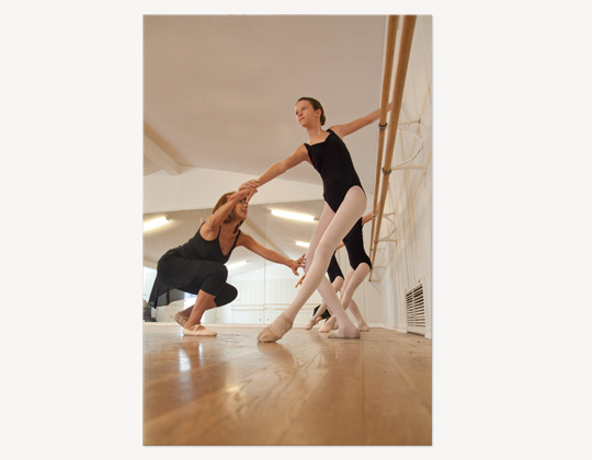
Bravo Ballet: Print Ads
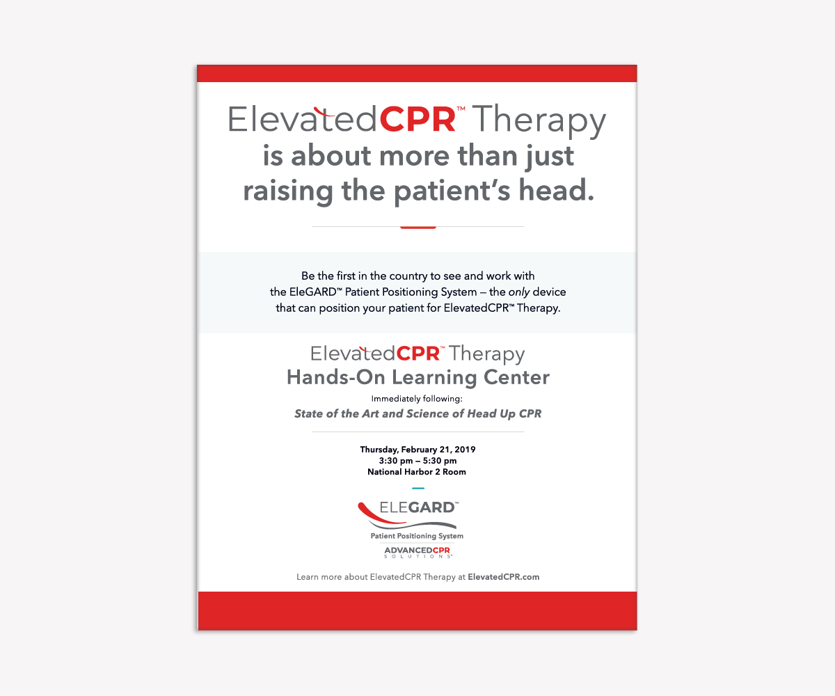
Interventional Radiology: IR News Ad
Entrigue Surgical
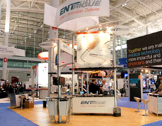
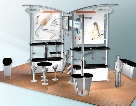
ENTrigue Surgical: Tradeshow Booth
Antonian College Preparatory High School: Capital Campaign Website
Sylvana Research Patient Recruitment
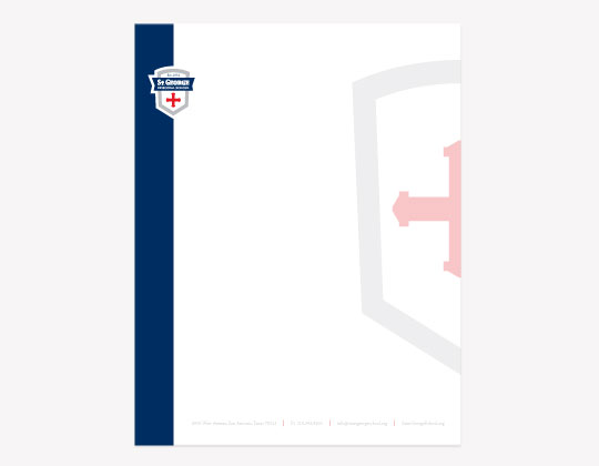
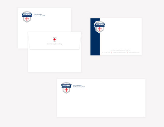
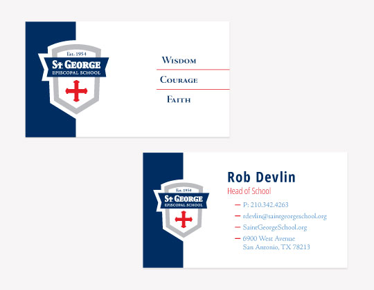
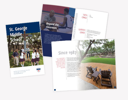
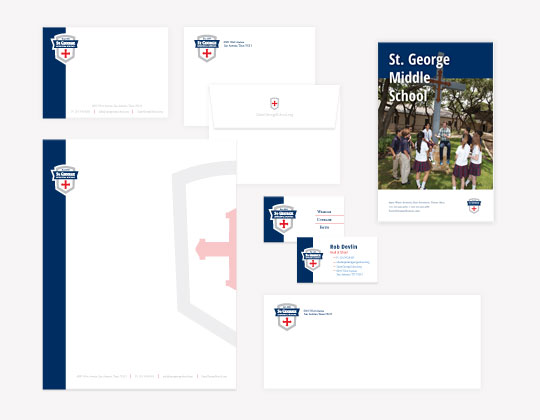
St. George Episcopal School: Branding
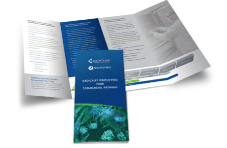
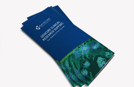
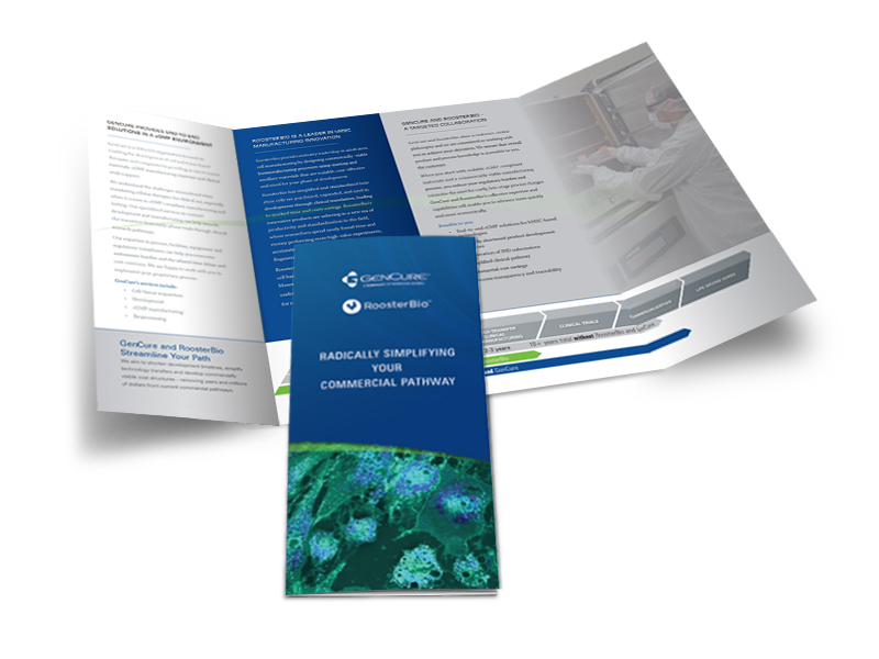
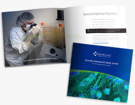
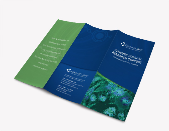
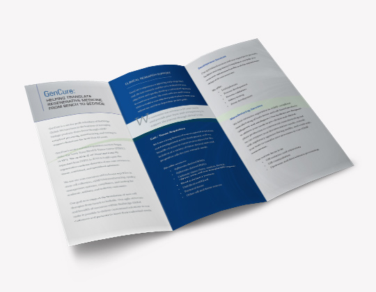
GenCure Tri-fold Clinical Research Support Brochure
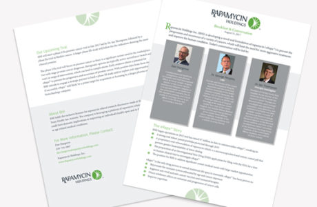
Renovo Concepts Logo
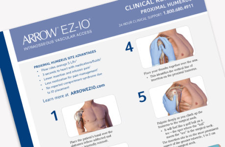
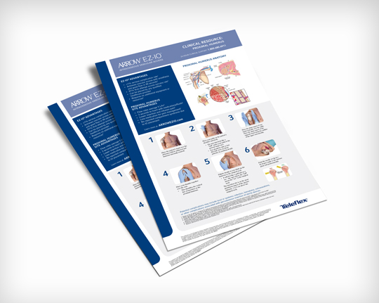
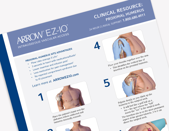
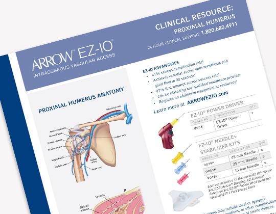
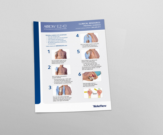
Teleflex: EZ-IO Clinical Placement Guide
Summit Oak Homes: Branding
The Music Place: Branding
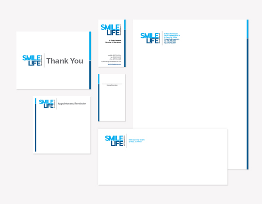
Smilelife Orthodontics Logo & Identity Package
Marketing Capabilities
- Strategic Planning & Execution
- Brand Development & Launch
- Product Naming/Logo Creation
- Website Design & Development
- Sales Tool Design & Development
- Tradeshow Booth Design & Materials
- Product Packaging & Labeling
Contact Us
Let’s talk!
Need help building your brand? Strategy for a new product launch? Product packaging? Let our team create a custom blend of tools and ideas to help your company thrive.
- 210.384.2008
- hello@krobertsco.com
- like us
